
Razbakes embarked on its adventure during the COVID Crisis of 2020, fueled by a desire to bring joy to those feeling uneasy. The mission was simple: to chase the dream of the perfect cookie. Armed with boxes filled with mouth-watering delights and accompanied by heartfelt notes, Razbakes took to Instagram, inviting friends to swing by and pick up these delicious treats.
What started as a small gesture quickly blossomed into a community of cookie enthusiasts, with Instagram posts garnering heaps of likes. And so, the sweet journey of Razbakes officially kicked off as orders began pouring in, and the loyalty of customers grew.
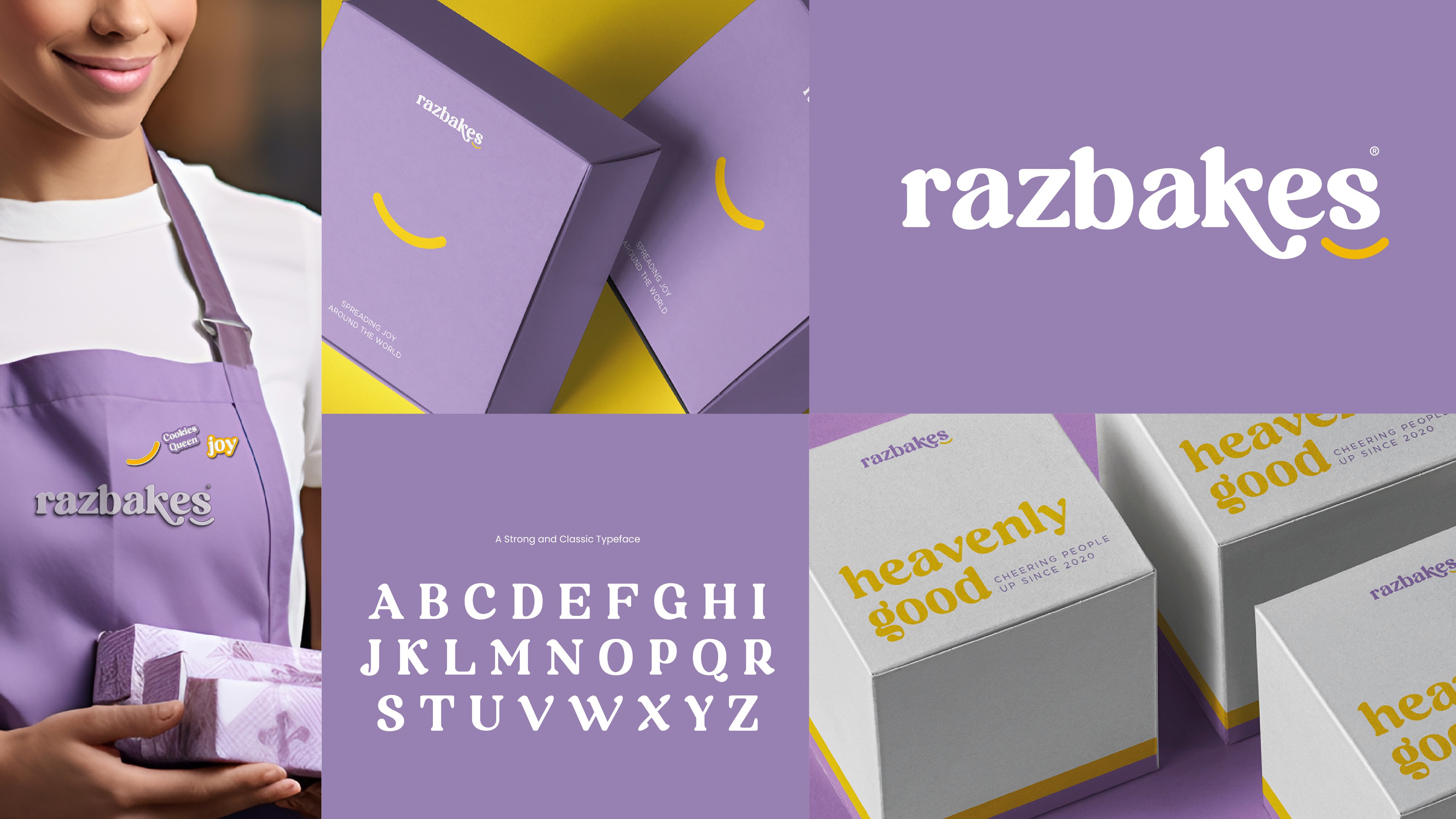
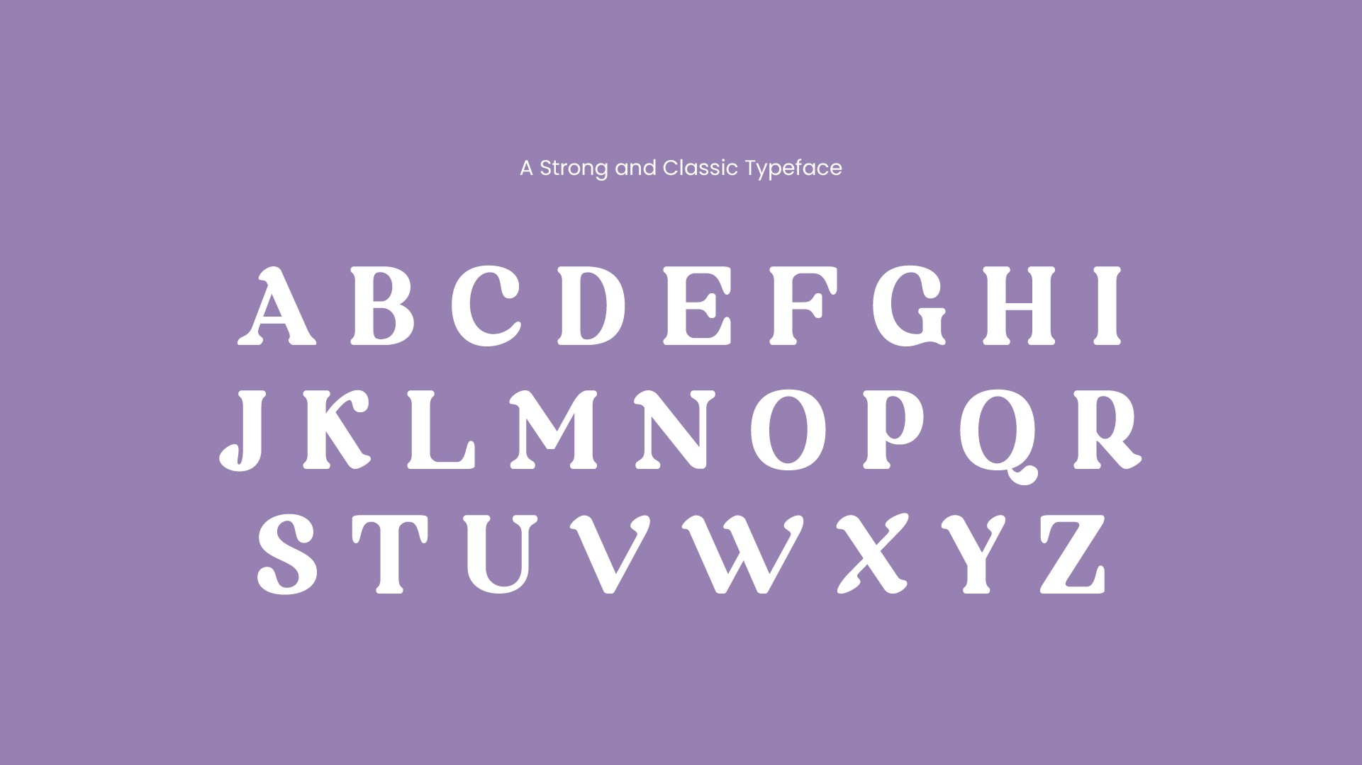
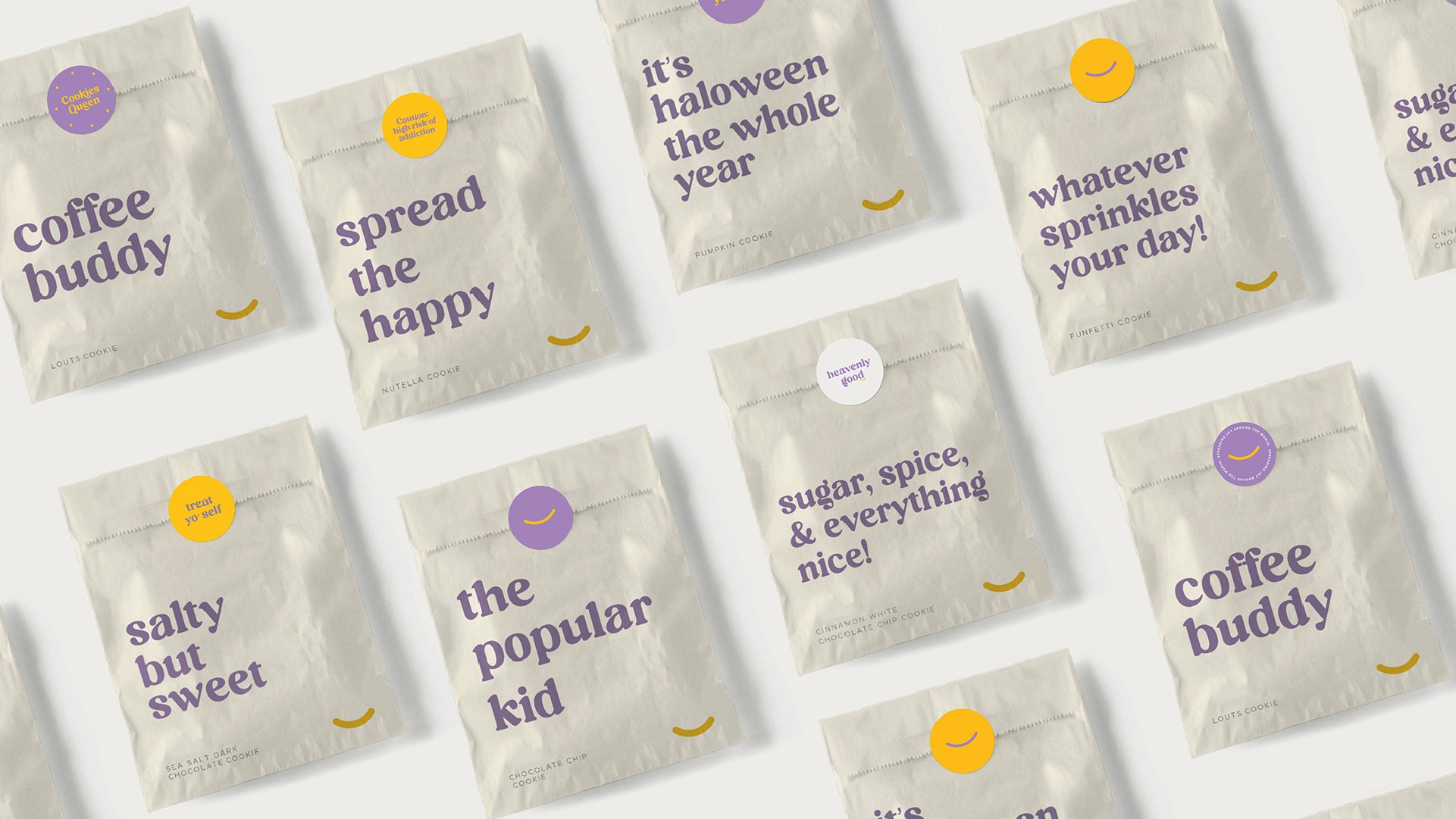
At the heart of the fresh identity lies the Serif classic typeface—a tailored variable font that seamlessly transitions from charming to mouthwatering. This typeface extends across the entire Razbakes experience.
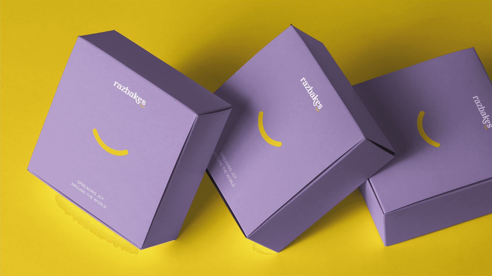
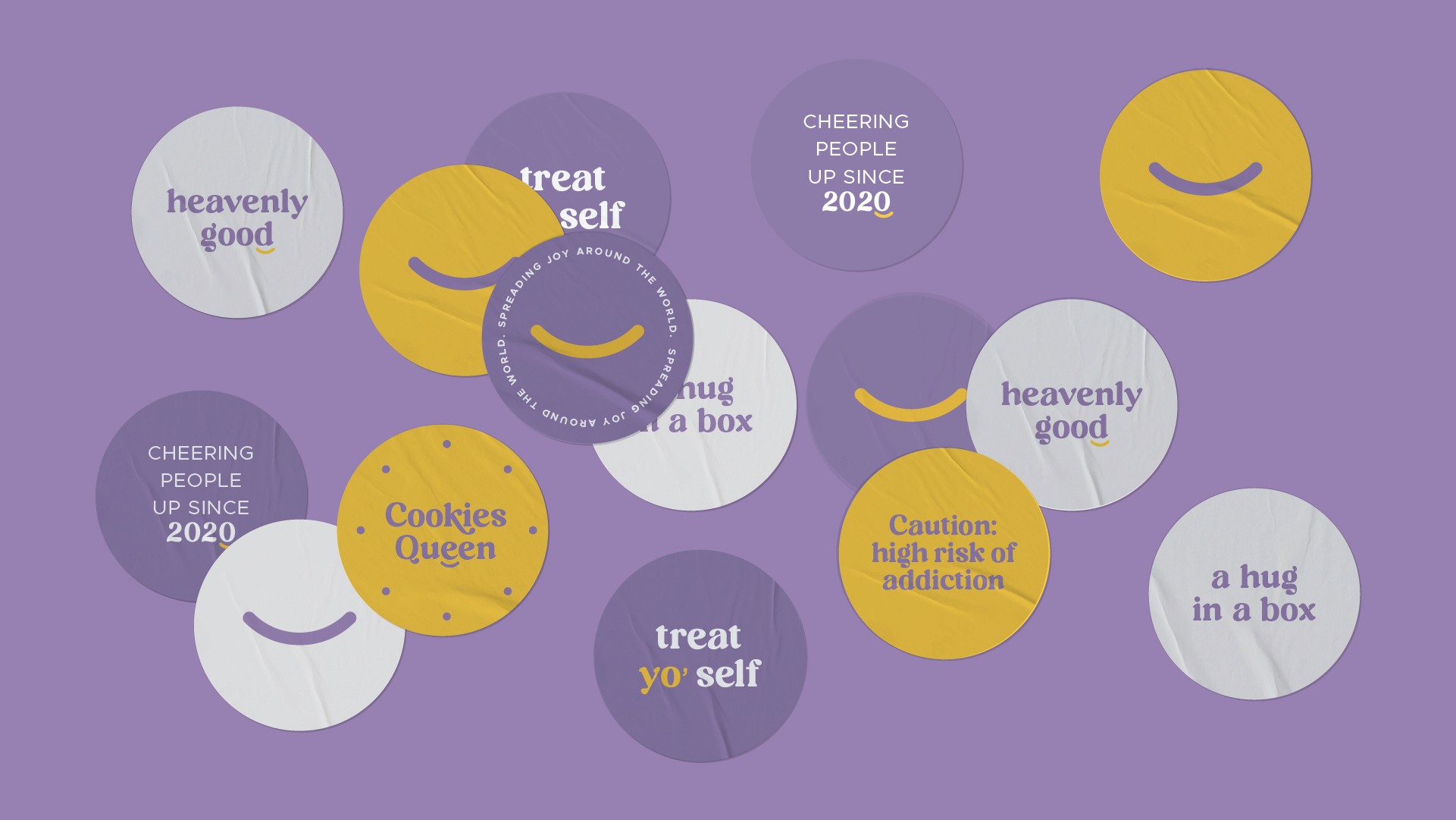
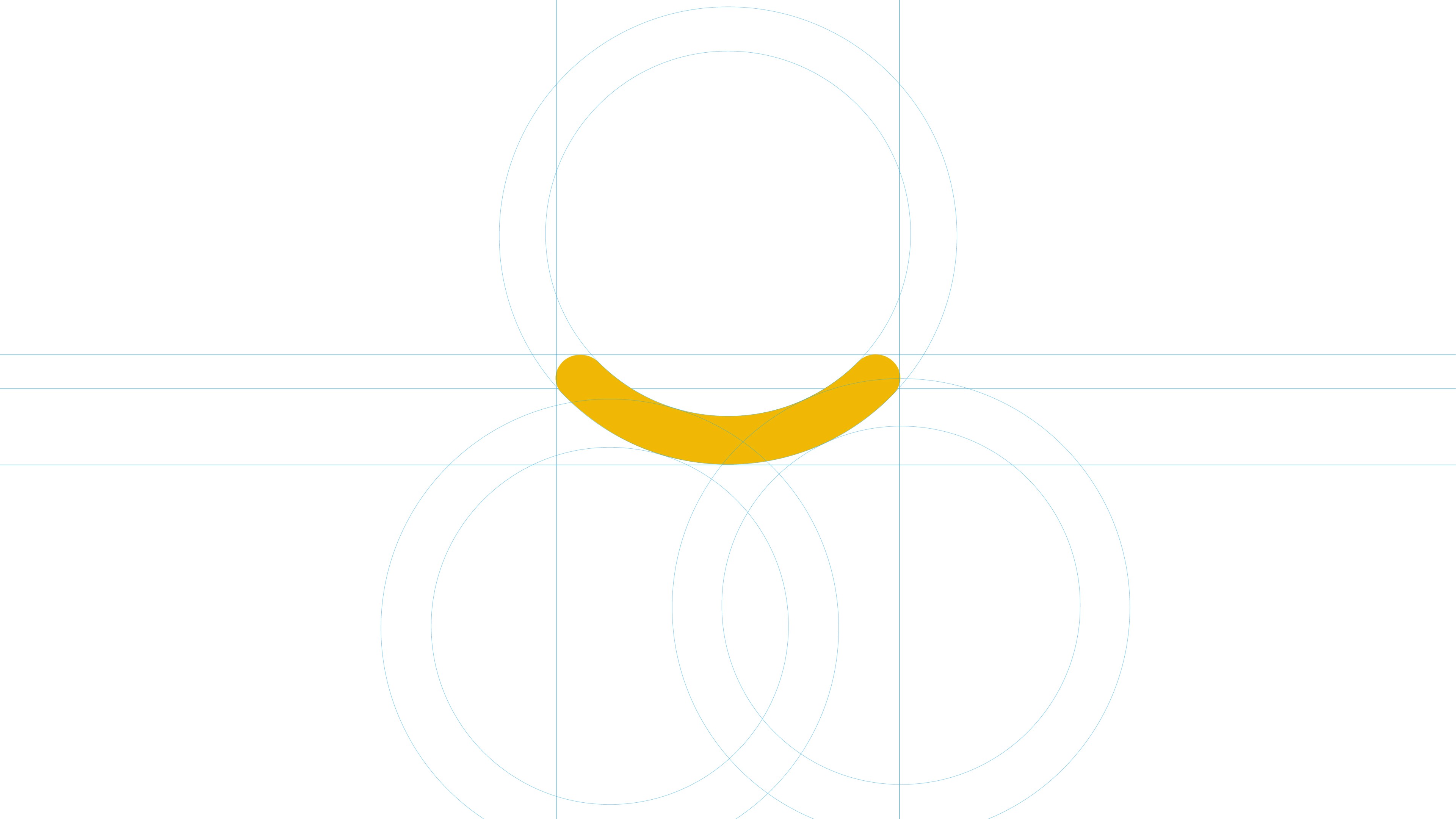
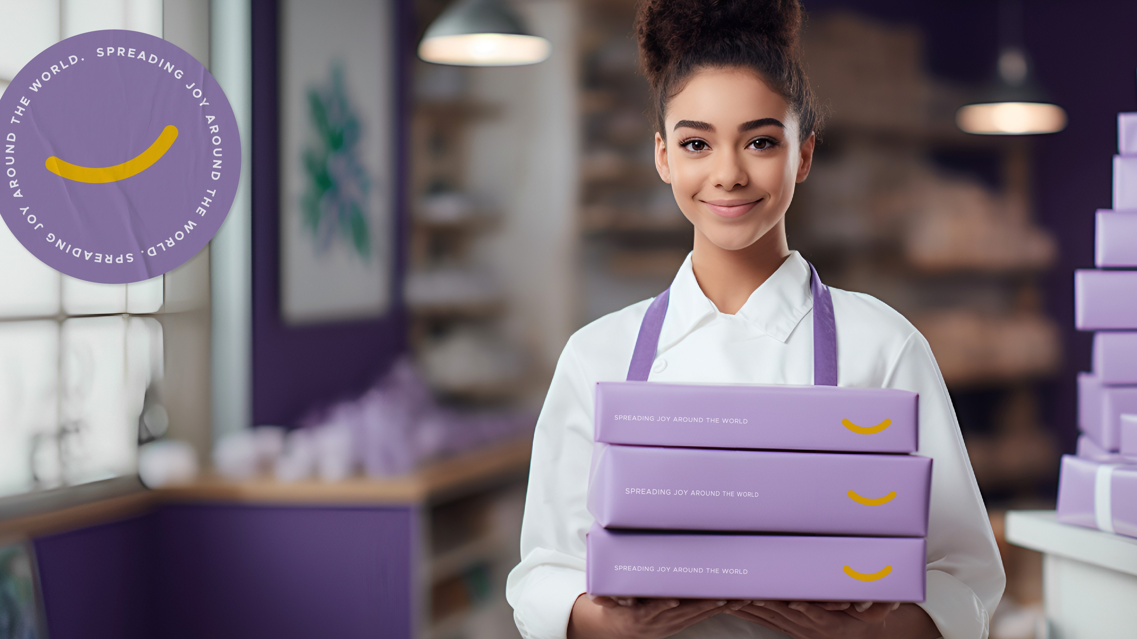
Embracing the Razbakes emblem, its unique shape was seamlessly integrated into the new identity, ensuring the emblem retained an even more distinctive presence.
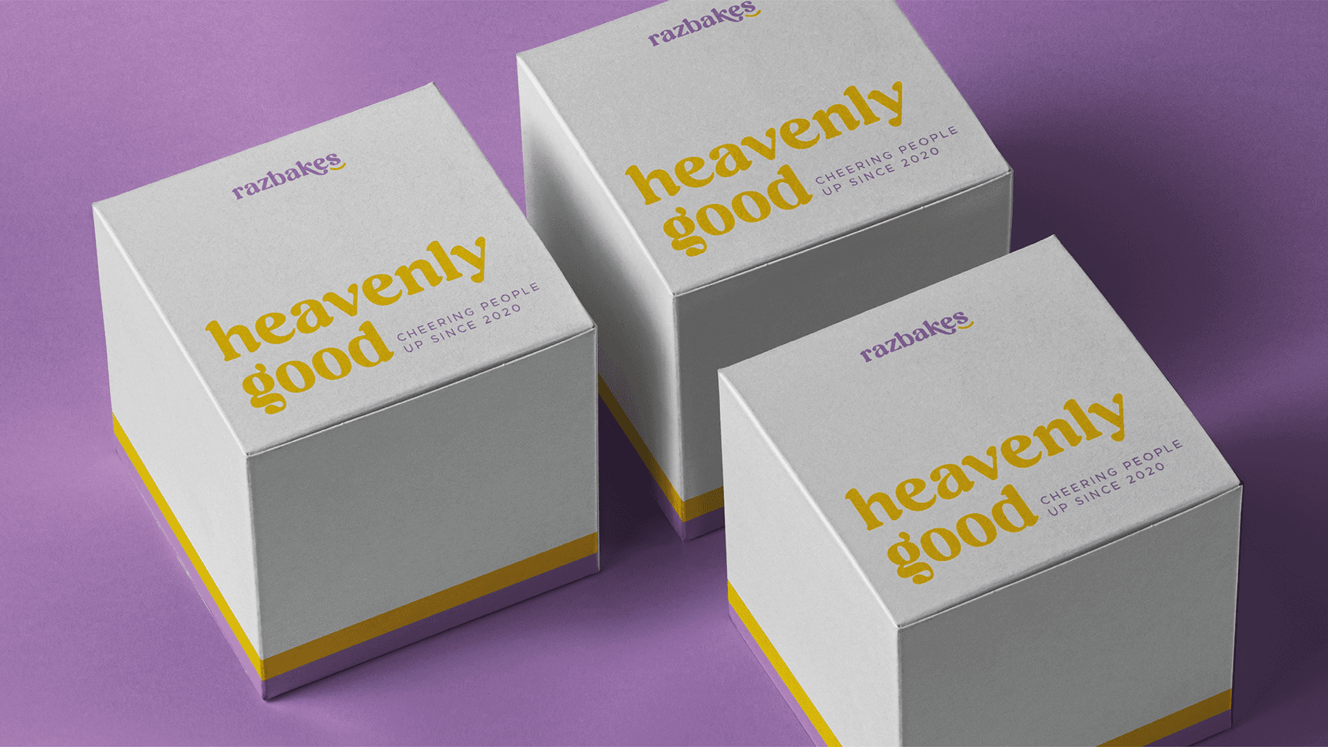
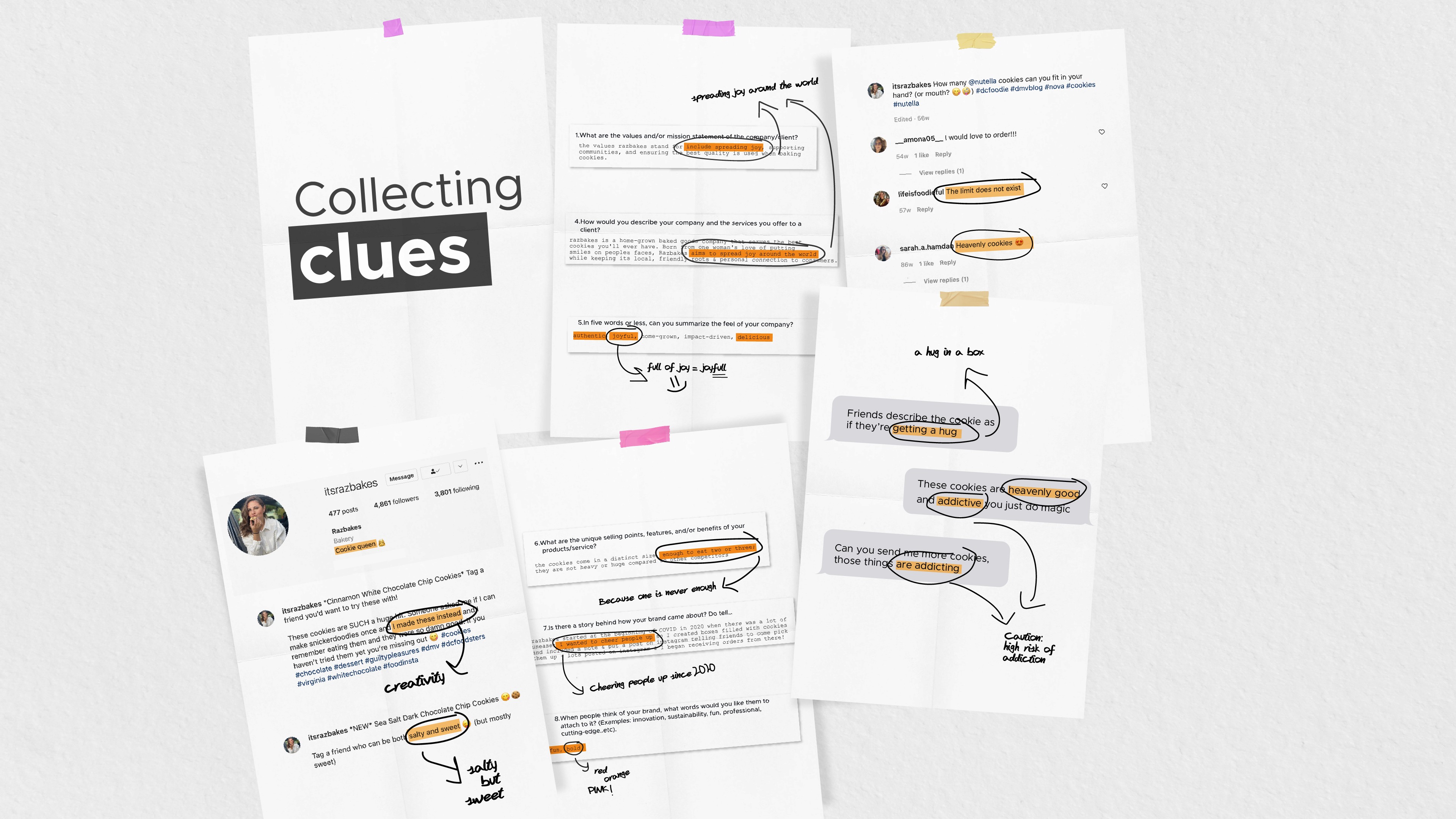
During the research, Razbakes cookies were consistently described as "heavenly" and "heavenly good." Consequently, the feedback on the cookies and Razbakes' Instagram comments became the primary foundation of the Razbakes concept.


Razbakes embarked on its adventure during the COVID Crisis of 2020, fueled by a desire to bring joy to those feeling uneasy. The mission was simple: to chase the dream of the perfect cookie. Armed with boxes filled with mouth-watering delights and accompanied by heartfelt notes, Razbakes took to Instagram, inviting friends to swing by and pick up these delicious treats.


What started as a small gesture quickly blossomed into a community of cookie enthusiasts, with Instagram posts garnering heaps of likes. And so, the sweet journey of Razbakes officially kicked off as orders began pouring in, and the loyalty of customers grew.


At the heart of the fresh identity lies the Serif classic typeface—a tailored variable font that seamlessly transitions from charming to mouthwatering. This typeface extends across the entire Razbakes experience.

Embracing the Razbakes emblem, its unique shape was seamlessly integrated into the new identity, ensuring the emblem retained an even more distinctive presence.

During the research, Razbakes cookies were consistently described as "heavenly" and "heavenly good." Consequently, the feedback on the cookies and Razbakes' Instagram comments became the primary foundation of the Razbakes concept.


Razbakes embarked on its adventure during the COVID Crisis of 2020, fueled by a desire to bring joy to those feeling uneasy. The mission was simple: to chase the dream of the perfect cookie. Armed with boxes filled with mouth-watering delights and accompanied by heartfelt notes, Razbakes took to Instagram, inviting friends to swing by and pick up these delicious treats.


What started as a small gesture quickly blossomed into a community of cookie enthusiasts, with Instagram posts garnering heaps of likes. And so, the sweet journey of Razbakes officially kicked off as orders began pouring in, and the loyalty of customers grew.


At the heart of the fresh identity lies the Serif classic typeface—a tailored variable font that seamlessly transitions from charming to mouthwatering. This typeface extends across the entire Razbakes experience.

Embracing the Razbakes emblem, its unique shape was seamlessly integrated into the new identity, ensuring the emblem retained an even more distinctive presence.

During the research, Razbakes cookies were consistently described as "heavenly" and "heavenly good." Consequently, the feedback on the cookies and Razbakes' Instagram comments became the primary foundation of the Razbakes concept.


Razbakes embarked on its adventure during the COVID Crisis of 2020, fueled by a desire to bring joy to those feeling uneasy. The mission was simple: to chase the dream of the perfect cookie. Armed with boxes filled with mouth-watering delights and accompanied by heartfelt notes, Razbakes took to Instagram, inviting friends to swing by and pick up these delicious treats.


What started as a small gesture quickly blossomed into a community of cookie enthusiasts, with Instagram posts garnering heaps of likes. And so, the sweet journey of Razbakes officially kicked off as orders began pouring in, and the loyalty of customers grew.


At the heart of the fresh identity lies the Serif classic typeface—a tailored variable font that seamlessly transitions from charming to mouthwatering. This typeface extends across the entire Razbakes experience.

Embracing the Razbakes emblem, its unique shape was seamlessly integrated into the new identity, ensuring the emblem retained an even more distinctive presence.

During the research, Razbakes cookies were consistently described as "heavenly" and "heavenly good." Consequently, the feedback on the cookies and Razbakes' Instagram comments became the primary foundation of the Razbakes concept.
